A/B testing has long been the gold standard in the world of digital marketing. In short, it’s your way to stop wondering “will this option work?” and start knowing for sure. In the data age, when every click can be measured, A/B testing is the way to avoid wasting budgets and achieve results faster and more efficiently.
What is A/B testing in simple words?
Imagine you have two options: say, two different buttons on your website. One is green and says “Buy” and the other is orange and says “I want this.” Both take you to the same page, but you don’t know which one is better. A/B testing is a way to see which button gets more people to click.
The principle is simple: you divide the audience in half. One part sees option A, the other part sees option B. After a certain period, you compare the results: the number of clicks, applications, purchases, or any other goal. And you get an answer based not on guesswork, but on real data.
Instead of buttons, it could be two different headlines in an email newsletter, two banner ad variations, or even two landing pages. The A/B testing format is suitable for almost any element that interacts with the user.
Why conduct A/B tests?
The most obvious reason is increased conversions. When you test two options and choose the best one, performance naturally increases. But that’s not the only benefit.
A/B testing allows you to make decisions based on numbers, not “I like it better.” This is especially important when you’re working on a team where everyone has their own opinion. Data is the only arbiter that doesn’t argue.
Additionally, proper testing can reduce your cost per acquisition (CAC). If your creatives, landing pages, or emails perform better, you need less budget to get the same results.
What can be tested?
Almost everything. Email subject lines, button texts, calls to action, page design, even pricing. For example, changing the subject line from “Download for free” to “Get a gift” can change conversions by 20–30%. And changing the button color from blue to red can double the CTR in some niches.
Banner ads are often tested: background image, character position, icon style. The same goes for landing pages — some users respond better to videos, others to animated infographics. They also test URLs, form design, text length, CTA position. Even a small detail, like changing the font size, can unexpectedly affect the result.
Sometimes testing price is risky but rewarding. If a product is selling worse than expected, A/B testing with a new price can yield unexpected insights.
A/B testing covers almost every element a user interacts with—from an Instagram banner to a button on a website. But before you launch everything at once, focus on key touchpoints. Here’s a closer look at what makes sense to test—and why.
Email headers
The first 5–7 words in the subject line decide whether a person opens the email or sends it to the trash. For example: “30% off today only” or “Your personal offer is inside.”
In B2C correspondence, the first option often wins, and in B2B, the second one, because it looks less "aggressive."
Calls to action (CTAs)
Buttons like “Buy”, “Download”, “Learn more” may seem like small things, but they are what lead the user to the target action. You can test:
wording (imperative vs neutral);
button size and color;
placement on the page.
Prices
It sounds dangerous, but a change of even a few hryvnias affects perception. For example:
499 UAH vs 500 UAH — a win in consumer psychology.
The test "from 299 UAH" versus "only 299 UAH" may yield different results depending on the audience.
Colors and design
People perceive colors not only emotionally, but also associatively:
A green button is often associated with an action (“OK”, “Move on”), while a red button is associated with a warning.
Replacing a background photo with an abstraction with a real image of the user sometimes increases trust and conversions.
Landing pages
This is one of the most influential elements. Here you can test:
structure: long vs short landing page;
order of blocks (CTA or social proof first);
visual part: banner, icons, fonts.
Advertisements in advertising
In paid advertising on Facebook, Instagram, Google, or any other platform, the cost of making a mistake is high. You can spend tens or hundreds of dollars every day — and still not understand why the campaign is not working. Sometimes the problem is not in the audience or the product itself, but in the details: the image, the format, or even the tone of the headline. This is where A/B testing allows you to “feel the market with your finger” and understand what really affects your audience.
What to test in ads:
Presentation format. A carousel, video, static image, or animated banner all elicit completely different responses. For example, a video might work better in B2C, while a minimalist image with clear text would work in B2B.
Headline. A laconic offer like “30% off until the end of the week” or an emotional intrigue: “You definitely didn’t expect to see this…” A/B testing will help you understand which type of message resonates with your audience — rational or emotional.
The first few seconds of a video. Especially in TikTok, Reels, or YouTube video ads, the opening frame and 2-3 seconds are everything. Show action, provoke, add movement or drama — and see what holds attention better.
These details may seem like small things — but on a grand scale, even a 1% difference in CTR means hundreds of dollars in saved budget or additional bids. And while competitors rely on “seems,” you can see real numbers and make decisions without intuitive roulette.

Link
At first glance, hyperlinks may seem like just a technical detail. But in reality, links often determine how deep you can dig into your A/B test results. They’re not just a way to redirect a user — they’re also a way to track their journey, understand the source of traffic, and test the effectiveness of a particular creative or platform.
There are several ways to test links:
Short or long? Short links look cleaner, are better received on social media, and don't scare customers away with their bulky appearance.
With or without UTM tags? UTM parameters are a must-have attribute for any test if you want to see detailed analytics in Google Analytics or another system. Without them, you simply won't know which creative worked.
A separate link for each option. This seems obvious, but many people don’t do it. The same URL for all test options devalues analytics. If you have 3 banners, make 3 unique links with separate UTMs — then you will see exactly which option “brings” users.
Snippets
It's about how your site looks on Google: page title, meta description, structured data. This is the first thing a user sees in the search results, and it's here that they decide whether to click or skip.
For example:
Title 1: "Buy tickets for the XYZ band concert — officially."
Title 2: "XYZ in Kyiv 10.07 — the best places here."

Even small changes can increase CTR many times over — without spending on advertising. To prepare effective snippets, use HyperHost 's free SERP snippet generator . It will help you visually simulate how the page will look in Google's search results and check whether the texts are cut off. Convenient, fast, and to the point.
All of these elements can—and should—be tested incrementally. Start with the most impactful ones: headlines, buttons, pages. Then move on to more nuanced things like colors or pricing wording. The essence of A/B testing is micro-changes with macro-effect.
How do short links help in A/B testing?
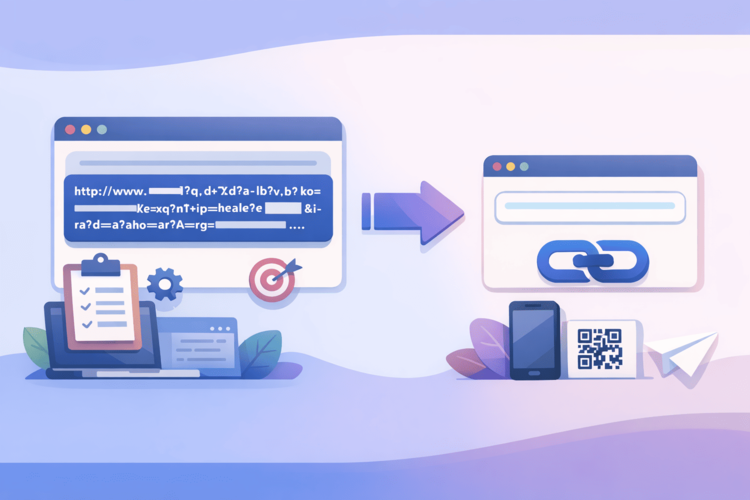
Short links are not only convenient, but also strategically beneficial for conducting A/B tests. First, they make it easy to create separate tracking URLs for different variants. For example, in Facebook ads, you can specify one landing page, but serve it with different links - and analyze which one received more clicks.
Secondly, link shortening platforms (like Bitly or Surl.li ) provide basic analytics without any additional integration. You can immediately see the number of clicks, traffic source, devices, geography. This helps you quickly understand which option works best even without Google Analytics.
Third, you can change the destination address after the campaign has been launched without changing the creative itself. This is especially convenient in situations where you are testing new landing pages but don't want to re-approve the banner in the advertising department every time.
The usage scenario is as follows:
Option A: https://surl.li/test-a
Option B: https://surl.li/test-b
Both lead to different versions of the page, and you just see which link wins. Minimum technical complexity — maximum benefit.
Other tools for A/B testing
There are dozens of testing tools on the market. The most popular are Optimizely and VWO. They have visual editors, automatic traffic distribution, and meaningful statistics. If you need to test web interfaces, these are a must-have.
Google Optimize, unfortunately, is no longer available, but its place is gradually being taken by integrated capabilities in systems like Unbounce or Tilda. If we are talking about email marketing, Mailchimp is a good choice, where you can test the subject of the email, the sender's name, or even the time of sending.
And for those who work with startups or MVPs, you can use simpler solutions - for example, manual traffic segmentation using UTM tags and reports in Google Analytics.
Common mistakes in A/B testing
The most common mistake is running the test on too small a sample. If you get 10 clicks on option A and 12 on B, it doesn’t mean anything. You need dozens or hundreds of conversions to draw any meaningful conclusions.
Another mistake is changing multiple variables at once. For example, you change the title and the design of a button at the same time — and you don’t understand what exactly affected the result. Test one parameter at a time.
Many people stop testing too early after seeing “encouraging” results. But fluctuations in the first few days are normal. You need to wait for stable statistics and only then make a decision.
Another trap is ignoring external factors. For example, during a promotion or info drive, traffic may increase, but it is not necessarily related to the changes you tested.

Conclusions
A/B testing isn't about proving someone right in an argument, it's about growth. It allows you to systematically improve your results based on numbers, not intuition.
You don’t need to test complex scenarios right away. Start simple — change the wording in the title or the color of the button. Learn to see the difference. And then — complicate it.
Short links are your assistant in this process. They simplify analysis, allow you to bypass some of the technical routine and get transparent results without unnecessary settings.
And most importantly, test regularly. The world is changing. User behavior is changing too. What worked yesterday may not necessarily work tomorrow. But if you test constantly, you're always one step ahead.


